5 Tips for a Perfect Family Photo Cookbook Cover
Christina - Jul 25, '20 - Cookbook Ideas - Getting Started - Photography - PhotosFamily photos make your family cookbook extra special and they can make for a gorgeous cookbook cover. However, selecting the perfect cover photo can be a bit tricky. Try these 5 tips to help!
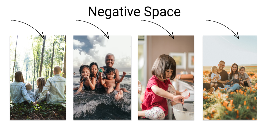
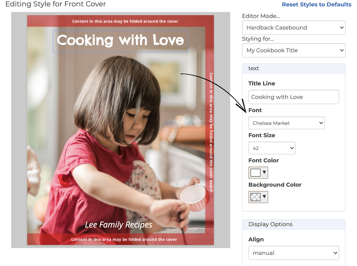
Choose a Photo with Negative Space
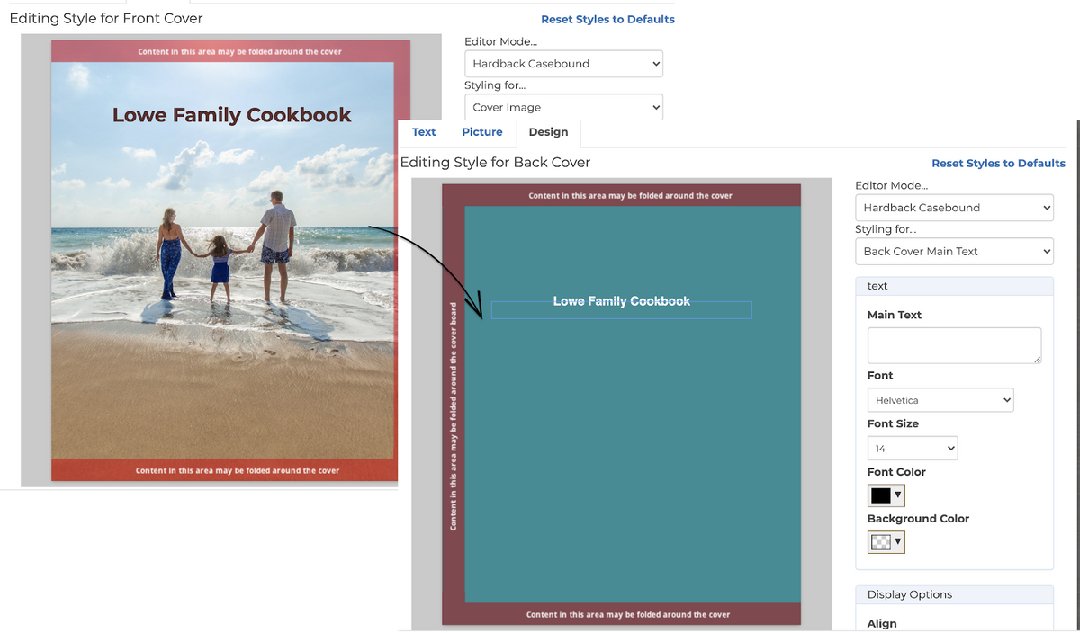
When choosing a photo for your front cover, select one that is portrait orientation and has plenty of negative space. This will allow you to add your cookbook title creating a cover that’s sure to impress your whole family.
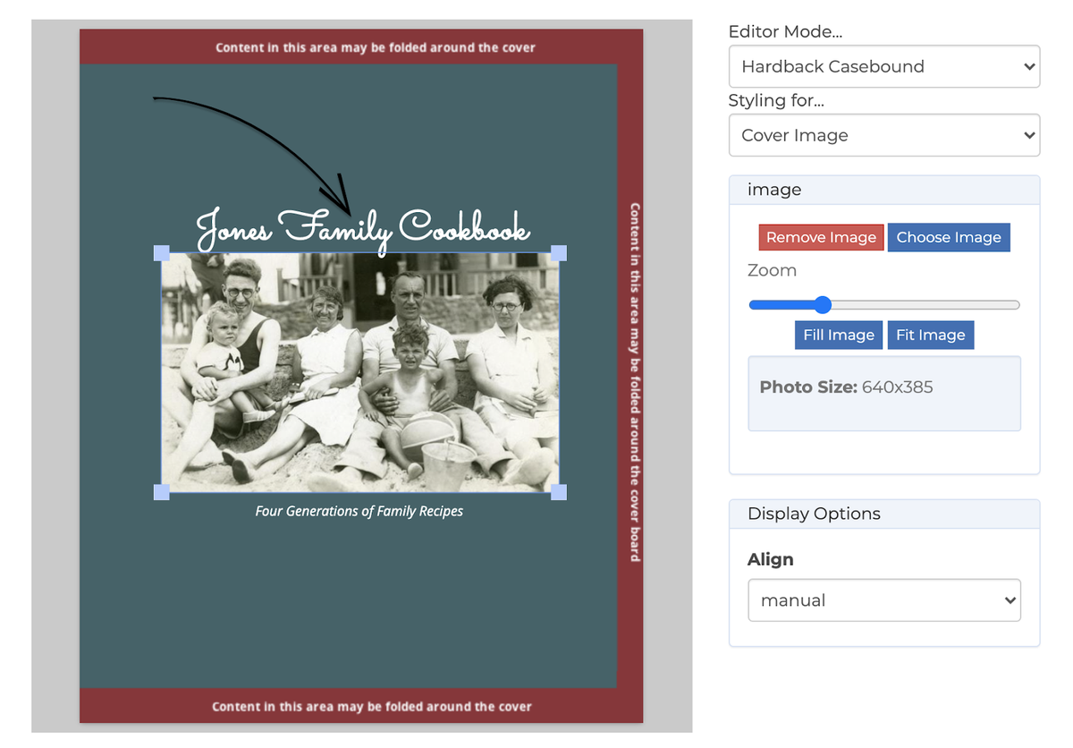
Centering your Photo
If you have a special photo that does not have any available negative space or is landscape orientation, not to worry! Simply center your photo on the cover.
Choose Your Font
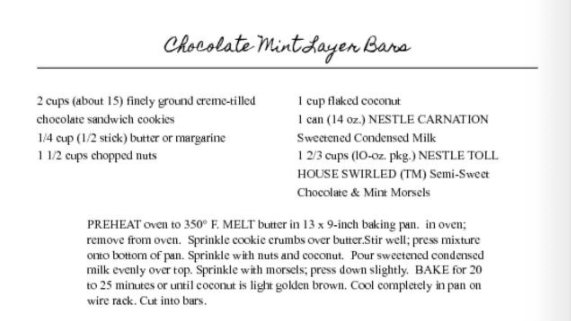
Selecting your font allows you to add a dash of personality to your cookbook. Here’s a few suggestions to get you started:
Fun/Lighthearted
Title Font: Pacifico
Body Contents Font: Open Sans
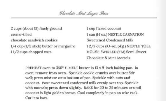
Traditional/Classic
Title Font: Homemade Apple
Body Contents Font: Times New Roman
Fancy/Delicate
Title Font: Pinyon Script
Body Contents Font: Lora
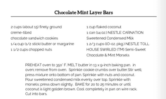
Modern
Title Font: Aleo
Body Contents Font: Raleway
Don’t Forget the Spine and Back Cover
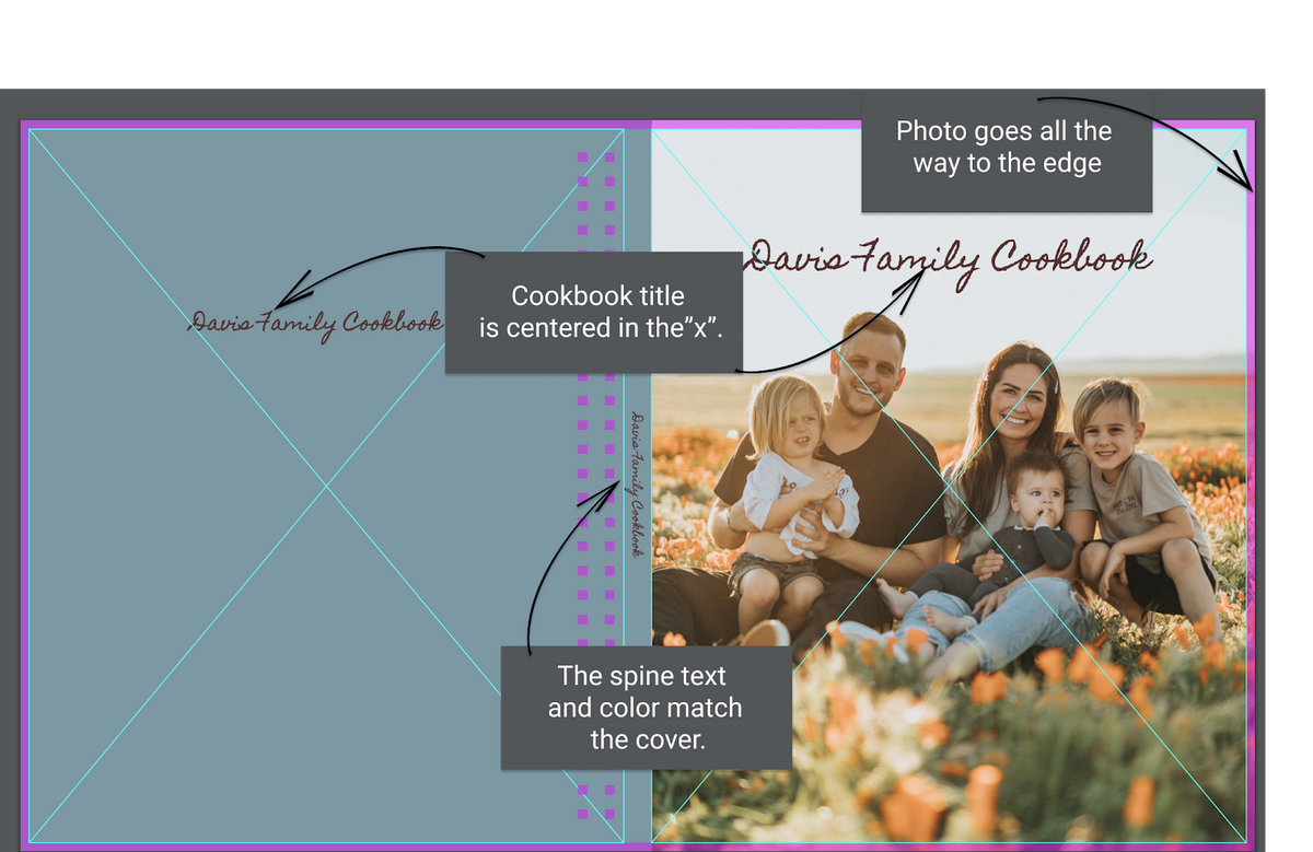
Make your cookbook look truly professional by matching your spine color and cover background color. You can also change the fonts to match the front cover! Bonus tip: Try to use a color that compliments your photo.
Review Your Proofs
Don’t forget to review your cover in your proofs. Make sure your photo extends to the edges of your cover, your title is centered in the “x” and your spine text/color matches your cover.
Now that you know all the ins and outs of cover design, it's time to get to work! Head back to your book here.
Chrissy 💕
Next: Greta's Enchiladas
